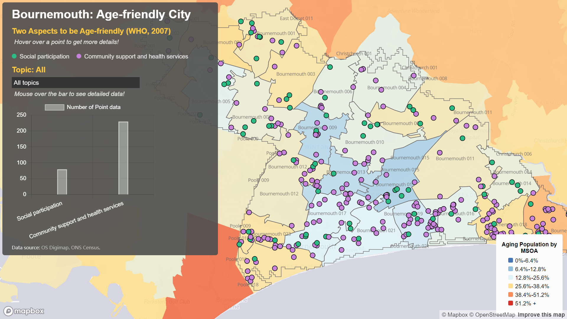
Welcome to our third webpage, dedicated to exploring the demographic and healthcare landscape of Bournemouth city at the Middle Layer Super Output Area (MSOA) level. Here, we present an in-depth analysis of the elderly population density distribution alongside the specific distribution of elderly care facilities.
The elderly population density is visualized in the form of spatial surfaces, providing a comprehensive understanding of where the elderly population is concentrated within Bournemouth. Meanwhile, elderly care facilities are depicted as points on the map. We have categorized these facilities into two main types based on the needs of the elderly: social engagement and healthcare services.
INTRO
The Aging Population and Future of Cities
The dramatic demographic change has made the future for city as a future for the elderly. By 2030, two-thirds of the world's population will be residing incities, with -for urban areas in high-income countries - at least one-quarterof their populations aged 60 and over (UN-Habitat, 2010). Therefore, it is urgent to develop enviroment response to the aspiration and needs of older people, embracing considerations of where, what and how this should happen.
Our website unfolds the data to stimulate discussion around the global trend in aging population, optimal elderly cities in England, and best practice of elderly-friendly facilities in cities. We hope to contribute to urban policy recommendation and the development of retirement-oriented design in cities.

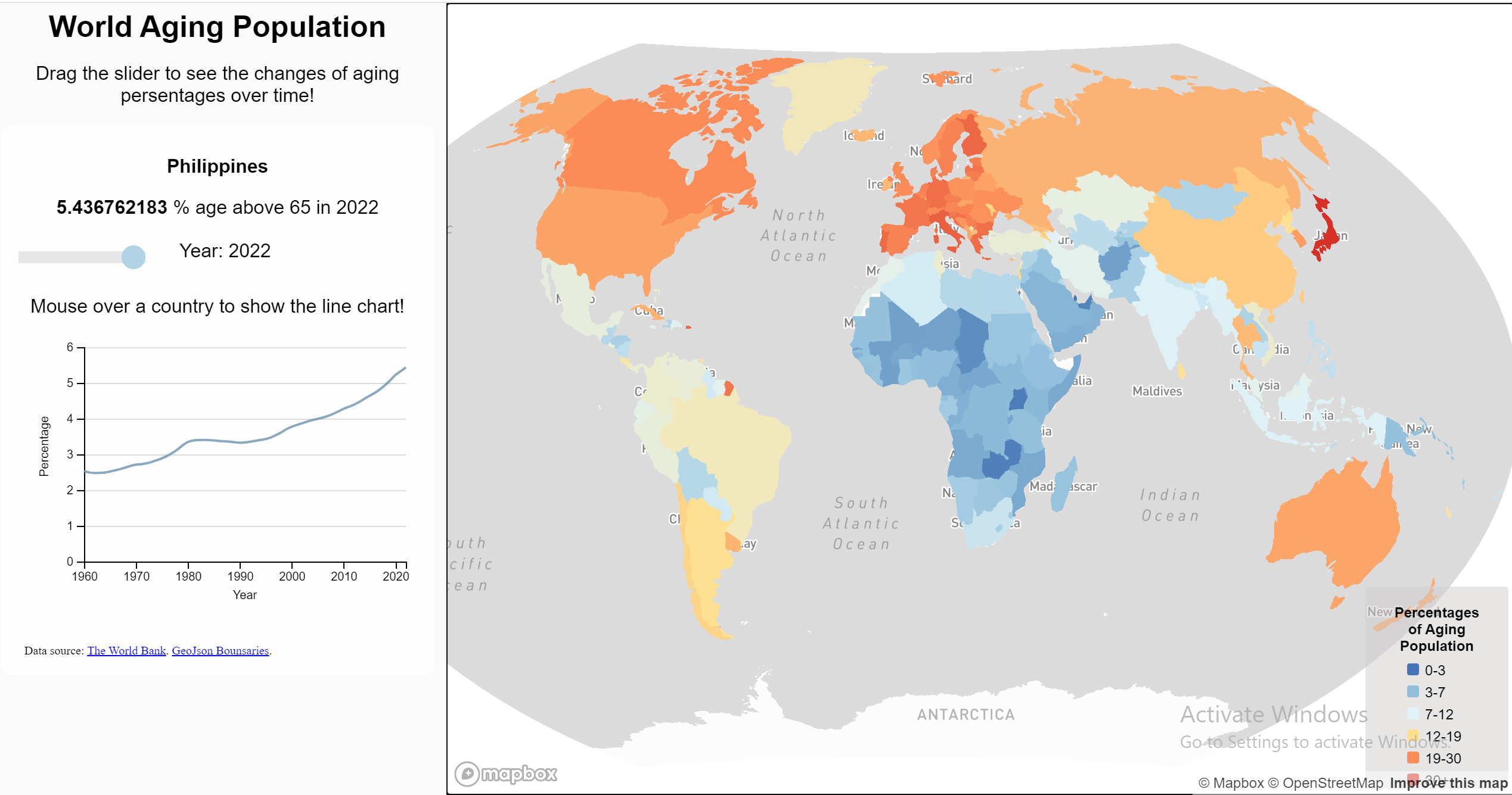
The Aging World
This is a data visualization page showcasing the changing proportions of elderly populations across various countries globally. We have collected data from 1960 to 2020, and with intuitive charts and interactive features, you can delve into the changing trends of elderly populations in different countries.
Instructions: Use a sliding slider to explore the changes in the elderly population of each country. By adjusting the slider, you can discover which countries have experienced significant changes in their elderly population proportions and which have seen minor changes. This interactive feature helps you quickly compare elderly population trends among different countries and gain an intuitive understanding of their magnitude of change.
In addition to observing overall trends, we also provide specific numerical values for the elderly population proportion in each country. These data can help you analyze the aging level of each country in greater depth and gain a more comprehensive understanding of global aging trends.
Findings
As the country develops, its population ages at an increasingly rapid pace and in greater proportions.
On the one hand, it implies that the aging trend is a 'major success story' to the development and urbanisation of civilisations; On the other hand, it brings challenges for the future cities to ensure equitable access to education, health and dailly facilities and services to boost the security at people's old age.
This leads to our exploration in map 2 and 3, where you might eager to find out our case study of Bournemouth, England.
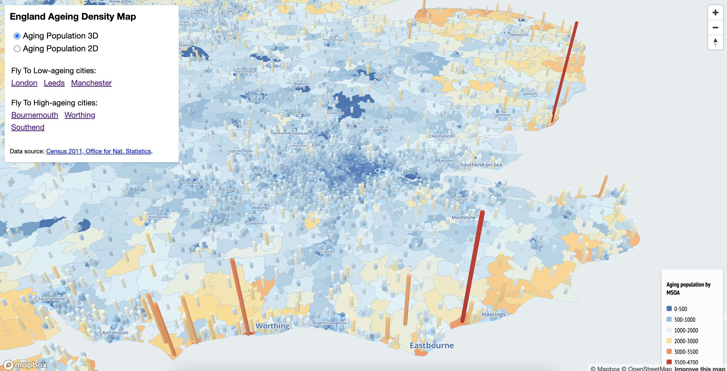
England Aging Population Density
Fly-over-to-cities: Elderly Population density of England in 2D and 3D
This page is dedicated to visualizing the density of elderly populations in England. We've divided it into two sections: 2D and 3D, each offering unique perspectives on the distribution of elderly populations across different regions.
Moreover, our interactive features allow you to zoom in on specific cities for a closer examination. By clicking on the flight icon, you can focus on cities you're particularly interested in exploring.
Findings
Through dynamic changes in color and the height of bar charts, you can easily discern patterns in elderly population distribution. For instance, coastal regions often exhibit higher densities of elderly populations, while inland major cities tend to have lower densities. By simply sliding your mouse, you can access specific numerical values representing the proportion of elderly populations in various cities.
Exploring Bournemouth
By hovering over these points, more details are introduced, including the name, category, classification and the postcode of the points.
Meanwhile, selecting a specific type of facility can help users delve into its statistical information regarding the number of facilities available.
Through the overlay analysis of these two datasets, users can intuitively identify areas where there may be a need to strengthen existing facilities or establish new ones.
Findings
For example, when it comes to Social Participation category, the bar chart reveals a need for more allotment gardens and community projects. Also, the sparse distribution of points in Bournemouth 002 suggests a need for additional facilities in this area.
For the other category, Community support and health services, resources appear ample for Bournemouth overall, with denser point data distribution in coastal regions compared to northern ones, indicating a better-suited environment for older populations near the coast.
Visualisation Recap
Here are previous visualisation you can revisit.
Map 1 shed light on the global aging phenomenon, highlighting countries with larger older populations, such as the UK, Finland, and Italy, where aging occurs at a faster rate.
Zooming in on the UK with Map 2, we discovered that the elderly population tends to cluster in smaller coastal cities, such as Worthing, Southend and Bournemouth.
Focusing on Bournemouth in Map 3, we examined its age-friendliness and found that while the city offers many amenities beneficial to older residents, there's a notable disparity between the northern and seaside areas, with the former needing more attention.
Moving forward, we hope this research in Bournemouth can serve as a blueprint for other similar British cities like Worthing and Southend mentioned in Map 2.
Teams
Here are out team member behind this visualisation

Kexin CHEN

Yixiao ZHAO